
Notice
Recent Posts
Recent Comments
Link
| 일 | 월 | 화 | 수 | 목 | 금 | 토 |
|---|---|---|---|---|---|---|
| 1 | 2 | 3 | ||||
| 4 | 5 | 6 | 7 | 8 | 9 | 10 |
| 11 | 12 | 13 | 14 | 15 | 16 | 17 |
| 18 | 19 | 20 | 21 | 22 | 23 | 24 |
| 25 | 26 | 27 | 28 | 29 | 30 | 31 |
Tags
- DataAccess
- function
- 반복문
- analizer
- count()
- matplotlib
- nan
- len()
- hierarchical_clustering
- append()
- del
- data
- Machine Learning
- IN
- insert()
- sklearn
- numpy
- list
- dendrogram
- wcss
- 최솟값
- 분류 결과표
- 덴드로그램
- Python
- elbow method
- pandas
- 최댓값
- DataFrame
- string
- Dictionary
Archives
- Today
- Total
개발공부
[Python] Matplotlib Histogram(히스토그램) 본문
import numpy as np
import pandas as pd
import matplotlib.pyplot as plt
import seaborn as sb

%matplotlib inline
Histogram(히스토그램)
- 구간을 설정하여,해당 구간에 포함되는
데이터가 몇개인지 세는 차트를 히스토그램이라한다.
- 구간을, 전문용어로 bin 이라고 부른다.
- bin이 여러개면, bins 라고 부른다
- 히스토그램의 데이터는 동일하지만,
구간을 어떻게 나누냐에 따라서, 차트 모양이 여러가지로 나온다.
아래는 포켓몬 세대와 종에 대한 정보가 담겨있는 데이터 프레임이다.

speed 컬럼을 분석하면 아래와 같은 값이 나온다.
>>> df['speed'].describe()
count    807.000000
mean      65.830235
std       27.736838
min        5.000000
25%       45.000000
50%       65.000000
75%       85.000000
max      160.000000
Name: speed, dtype: float64
speed 값의 구간에 따른 데이터의 갯수에 대한 히스토그램을 그려보면 아래와 같이 만들 수 있다.
plt.hist(data = df, x = 'speed', rwidth = 0.8)
plt.show()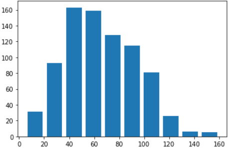
bin(구간) 의 갯수를 변경하는 경우 아래와 같다.
# bin 의 갯수 = 20
plt.hist(data = df, x = 'speed', rwidth = 0.8, bins = 20)
plt.show()
'Python > Matplotlib' 카테고리의 다른 글
'Python/Matplotlib' Related Articles
more


